


To truly conquer Instagram you need three things: an engaging post, the right hashtags and an attractive photo. For many of us, the photo is the most challenging component. But the good news is that it’s a myth that you need an expensive camera to take a quality photo. Today’s smartphones are highly capable of taking professional quality photos.
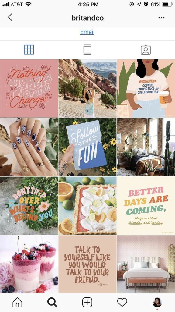
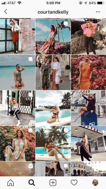
But before you pull out your camera or phone and start snapping, think about your profile feed. Because your feed appears like a grid when someone goes to your profile, your Instagram images should reflect a look and feel that is not only engaging, but is consistent with your brand. The presentation of your feed is what will drive your profile visitor’s decision of whether or not to follow you.
Set a strategy for the overall look and theme for the photos you’ll post. There are no real hard and fast rules for your grid but whatever you choose to do, be consistent. Take the time to carefully plan each square (aka photo) on your grid. Then just follow a few simple guidelines.
Color Palette
The photos on your grid should tentatively stick to a color scheme. You can do this a few ways. First, you can take photos that fall into your selected color palette. Or you can use a filter to edit and highlight the colors in your pictures.
The main reason to stick to a color scheme for your Instagram images is recognizability (think Brit + Co’s signature pastels or Glossier’s iconic Millennial Pink).
There’s also psychology behind certain colors in marketing. Orange and red generates a feeling of warmth and are generally thought of as fun or energizing colors, while cool tones like blue are associated with calm and reliability. Depending on what kind of message you want to convey, your color scheme can say more than you think.
Planning
If you want to plan out what your grid looks like before you post your photos, you have a few options. Tools like Planoly, UNUM or Preview allow you to play around with post order so you can see how your profile will look before you publish images. Each app has a number of free and paid features that can be helpful for creating, scheduling and auto-publishing your posts, so test out what works best for your needs.
Lighting
We’ve heard it before, but it can’t hurt to repeat: natural light is best. If you’re taking photos at night or without a natural light source, artificial lighting will work just fine in a pinch. That being said, the best time of day for taking photos is during the golden hour (aka the magic hour) — the period of time right after sunrise or just before sunset when the sun’s light is illuminating but soft.
To prevent unwanted shadows, the source of your lighting should be facing the subject. For example, if you’re taking a photo of a person, that person should be facing the light.

Composition
Be mindful of how you compose your Instagram images. Making a deliberate choice to position your point of focus can make a huge difference in how your photo turns out. Make your life a whole lot easier by putting the focus of your image in the center of the photo or using the rule of thirds (turn on your camera grid to help with this).

Background
Take a look around your subject and make sure the background compliments your photo. Be sure to remove objects that don’t go with the photo (i.e., coats hanging on chairs, garbage, and other unsightly, albeit normal items). You can always edit in post, but it’s less work for you to start with a clean photo.


Editing Photos
Smartphones have wonderful photo editing tools, even without using third party apps. These quick tips will help make sure your photos look polished.
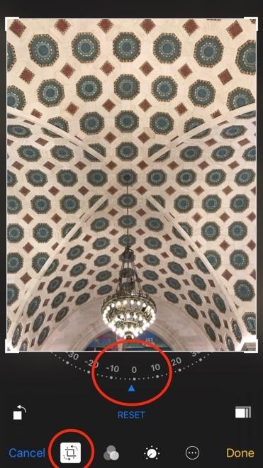
Crop and Straighten
Crop your photo to fine tune your composition or to trim out any unnecessary background. And don’t forget to straighten! This will help give your photos a professional touch that most people forget about.
Touch Ups
Most photos don’t need a lot of editing. Too much editing can make your photos low quality and grainy. Touch up your photos by playing around with the basics like contrast and exposure.
Applying Filters
There are a lot of good third-party apps for photo filters. VSCO is one of the top photo editing apps, but Tezza and A Color Story are other great options for colorful, travel-inspired filters.
If you choose to use a filter, choose one that compliments your brand and use it consistently in every photo. This will ensure your grid is cohesive and your brand identity is easily recognized by your audience.
TLDR:
Here’s a rundown of everything you need to know about Instagram images in bite-sized bullets.
- Your profile grid is one of the first things people see when they discover your IG profile, so put some thought behind it as a whole and not just post by post.
- Color association is important. The palette you choose should match your brand’s visual identity and help support the vibe you want to put out.
- When taking photos, pay attention to composition, lighting and backgrounds.
- Put a professional touch on your photos by making minor edits to fine tune — crop, straighten, touch up and use filters as needed.


LEAVE A COMMENT
Comments