Despite some talk that email is a thing of the past, 69.7% of U.S. internet users say email is their preferred method of communicating with businesses. And one of the best ways for businesses to reach their audiences is with an email newsletter.
While email newsletters can take many forms, the best ones have this in common: They deliver helpful content that is relevant to their audiences. Before you send out your next newsletter, check out the following tips to make sure you put your readers first and achieve both quality content and good design.
Know how your newsletter relates to your marketing goals
Launching an email newsletter just because you think you should isn’t a real strategy. That’s why the first step when starting an email newsletter is determining where you want to end.

Consider your top priority for your email newsletter. Are you hoping to stay top-of-mind with your past and existing customers? Drive more traffic to your blog posts or other website content? Promote events or other timely offers? There are a lot of outcomes to consider, but choosing one will help you focus the content of each newsletter.
Organize your newsletter around a theme or topic
Your topic doesn’t necessarily have to be as narrow as, say, BuzzFeed’s This Week in Cats newsletter (you guessed it — it’s a bunch of cat videos). However, your newsletter content should fit together logically for your readers so they have a sense of what to expect each time your email arrives in their inbox. If your newsletter has multiple sections, try to keep the section headers and layout consistent so users can remember which sections they like most and potentially jump to that part of the email.
Less promotion, more education
As a general rule, HubSpot recommends email content be 90% educational and 10% promotional. You may be hoping to increase website traffic or generate leads, but your readers aren’t signing up for your newsletter just to help you reach your marketing goals.
Lead with empathy by considering what your readers care about. If you were having an in-person conversation with a potential customer, what topics would be of interest to them? What might they be wondering about? How could you help them find information they are looking for?
Female-focused investment platform Ellevest launched a newsletter titled “What the Elle,” which delivers relevant investment advice and financial myth-busting blog posts to its subscribers. The majority of the email is educational, featuring posts like “What a Financial Planning Session’s Really Like.”
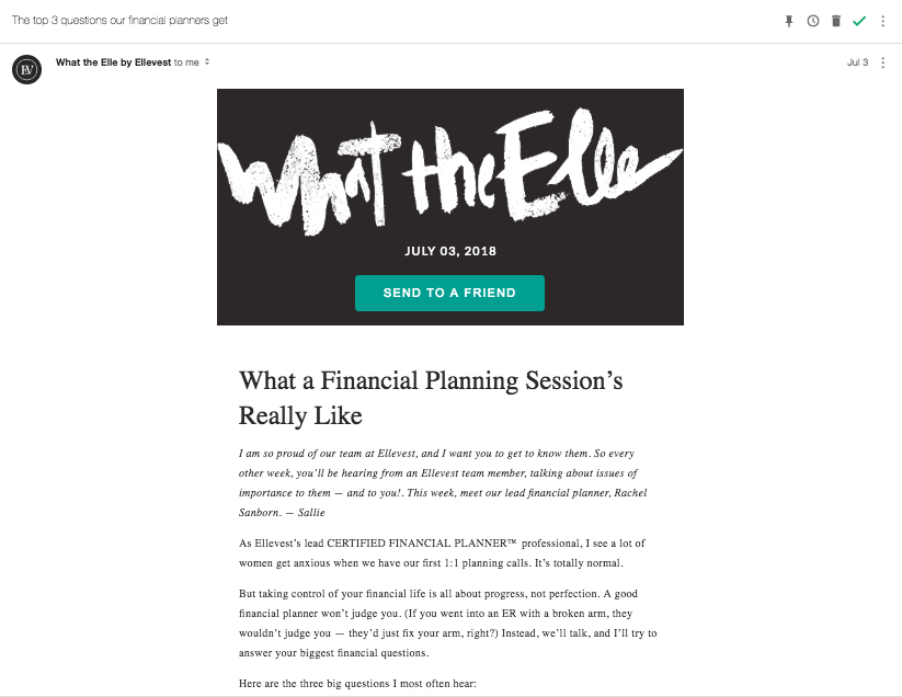
The only distinctly promotional components are found at the top and bottom of the email, where a call-to-action reads “Share the Wealth. Send to a Friend.”
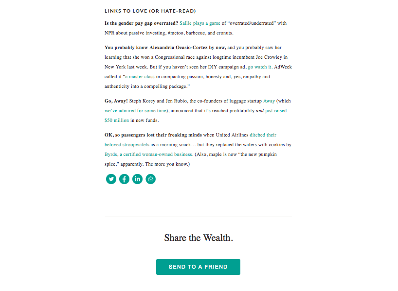
Rather than expounding on the many features of their investment platform, Ellevest focuses their newsletter on answering their readers’ biggest financial questions.
One way to put together newsletter topics is to start with your buyer personas. Stepping into your personas’ shoes will allow you to keep your emails helpful, focused, relevant and concise.
Don’t have buyer personas? Not to worry! Start here: Best Practices for Creating Buyer Personas.
Tell the truth
“Hi, You’re Fired.” The subject line of this BuzzFeed email is clickbait at its finest (well, more like at its worst). Subject lines like this one are designed to be attention-grabbing and entertaining rather than relevant and helpful. It may improve your email opens in the short term, but your subscribers will likely grow tired of this tactic and stop opening your emails, unsubscribe, or worst of all, mark the email as spam.
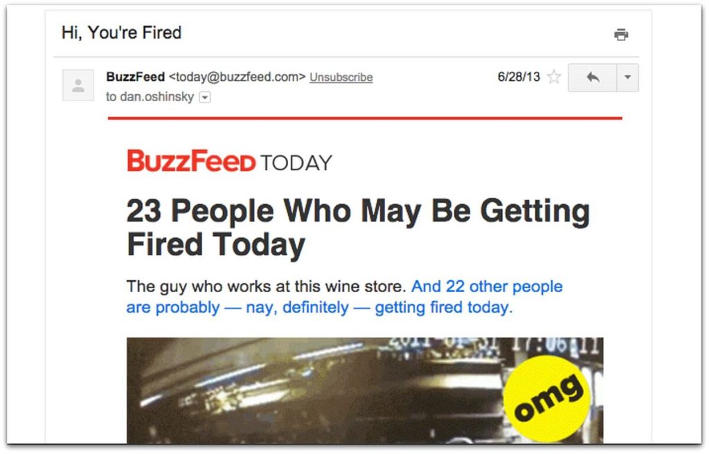
This is why we like to leave the clickbait to the rest of the internet. You can still be creative without being misleading, and your subscribers will recognize the consistency. The best email subject lines are ones that make the reader curious, rather than confused or disappointed. Let your readers know what they can expect from your email, whether it’s an offer, a video or just a cool story worth reading. Being straightforward doesn’t mean it has to be boring — check out this HubSpot blog for 16 examples of great email subject lines.
One way to make subject lines stand out is to use personalization tokens. In fact, research shows that subject lines that include the first name of the recipient have higher click-through rates.
Keep the design simple
Nothing makes me unsubscribe faster than opening an email filled with endless clutter. Your emails are a reflection of your brand, and a messy, crowded or overly-promotional email tells me that the company that sent it is unfocused and trying to take advantage of my attention.
Rather than cramming content into each newsletter, decide on a reasonable number of sections or blocks of content. Short and sweet is often best, as it lets the reader get straight to the most valuable information.
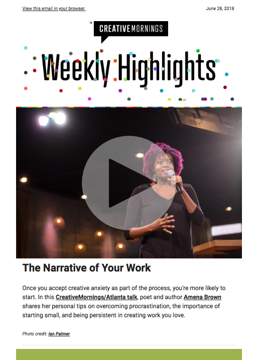
The screenshot above is the top section of a CreativeMornings newsletter where the primary focus is the video. The design is simple, fun and on-brand. Each section that follows (see below) has minimal copy and plenty of white space, making it easy to jump to what interests you most.
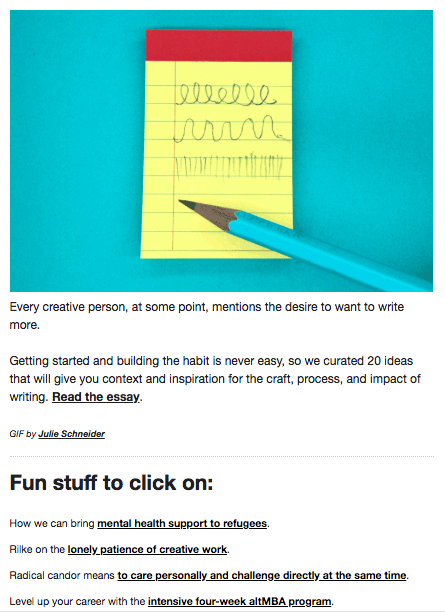
Stacking blocks of content like this may work for your newsletter, but there are plenty of other layouts to choose from as well.
Before you select a template, try sketching a few basic layouts on a sheet of paper. This will help you narrow down the list of available templates and not get distracted by the bells and whistles of the fanciest ones. If an additional feature distracts from the most valuable content of your newsletter, is it really helping you reach your goal?
My vote will always go to the simpler newsletters that have plenty of white space. When each section has room to breathe, it’s easier for the eye to move down the page and stay engaged.
One way to make emails less visually exhausting is to use short blocks of text with an option to dive in deeper. There’s no need to fill your newsletter with a 10-paragraph blog post when you could simply provide an intro and a link to “read more.”
If you already have ample white space in your email, look next at the colors you’re using for the headers and text. Are the colors on brand? Turn to your style guide to make sure the visual branding is consistent and recognizable.
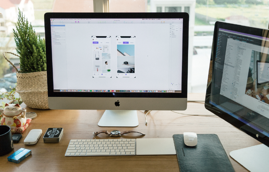
Lastly, that wild font that shows up perfectly on your screen won’t show up across all email clients — it may look the way you want in Gmail, but appear completely different in Outlook or Apple Mail. If it isn’t a commonly used font, it’s likely that it will be converted to one of the following web-safe fonts:
- Arial
- Courier
- Georgia
- Lucinda
- Tahoma
- Times New Roman
- Trebuchet
- Verdana
To avoid any font issues, you may want to use one of these web-safe options and add other elements to spice up the content. To spark your imagination, here are 40+ newsletter design ideas incorporating everything from simple GIFs to custom-made animations.
Use relevant visuals
Images are a great way to break up blocks of text, provide visual cues, and make the emails more recognizable and memorable.
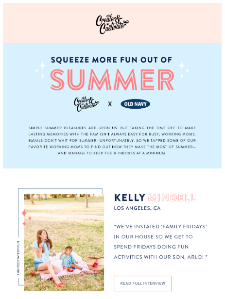
If you don’t have many original photos to use, sites like Unsplash are a great place to find stock photos that aren’t overly cheesy.
Another route is to use branded graphics. Work with your design team to create a handful of images and banners that can be used in each email to break up the different sections of the newsletter. If you’re expecting to have a new set of graphics for every newsletter, be sure that your design team has the capacity to take on the extra work.
When sending any email, make sure you’re following regulations
Companies that aren’t careful to follow CAN-SPAM regulations can face fines of up to $16,000 per email. If users haven’t specifically opted to receive your emails, don’t assume you have permission to email them.
Your newsletter subscribers should be able to open an email and know your physical mailing address, who the email is from and how to unsubscribe from all future emails. Stick to CAN-SPAM laws and you’ll preserve your brand’s reputation and build trust with your stakeholders.
Be a helper
The bottom line is that inbound marketing (including email marketing) is about providing real value and helping people solve their problems. Your newsletter is a great opportunity to do just that, and if you put your subscribers first you can create the kind of content they’ll look forward to seeing in their inbox.
Launching a newsletter AND a blog? Start here: When (and Why) to Create a Blog for Your Business.

LEAVE A COMMENT
Comments