


If you’re about to start working with a graphic designer, it’s worth taking a few minutes to learn some of the basic terms that will likely come up in conversation. Having a shared vocabulary helps eliminate confusion and miscommunication, and it allows everyone in the room (non-designers included) to contribute their thoughts and opinions in a way that is constructive and actionable for the design team. Knowing a few fundamental design principles and terms will improve communication, increase efficiency and ultimately help your designers reach the best outcome with a faster turnaround.
The following list is meant to be a straightforward guide for non-designers who are looking to understand the most commonly used design terms. Master this list, and you can bet your graphic designer will appreciate the fact that you can speak a little bit of their language. (Plus, you can impress your friends by pointing out the rule of thirds and the golden ratio every time you see it.)
1. Visual hierarchy
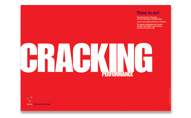
Visual hierarchy refers to the organization of certain elements in a composition based on their level of importance. This can be done with varying type sizes (see the image below) or with placement, color, or the use of icons and imagery. Visual hierarchy tells you which information is most important so that your eye naturally moves from one item to the next in the intended order.
In the example below, “CRACKING” is probably the first word you read. That’s because it’s the largest and stands out the most on the page. Next, your eye might read “PERFORMANCE” and then “Time to act” in the top right corner. If all of the words were the same size, typeface and color, you (or really, your brain) wouldn’t know what to look at first.
2. Balance
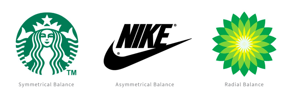
You already know what the word “balance” means, but in graphic design the word has a slightly different application. Balance refers to the way that elements are distributed and interact with one another on a page. Symmetrical balance, as seen in the Starbucks logo, is when all elements are equal along a central vertical line. With asymmetrical balance, the elements aren’t perfectly aligned around a particular line, but the arrangement of text, imagery and graphics still feels proportionate and complete, allowing for a sense of balance. With radial balance, as seen in the BP logo, elements are created around a central point.
3. Negative space (or white space)
Negative space, often referred to as white space, is void of imagery, text or any other type of graphic element. In other words, it is all of the empty space that surrounds the graphic elements on a page. Utilizing negative space is essential to creating a clean and sophisticated design because it allows the elements to breathe and not be crowded by other shapes.
4. Contrast
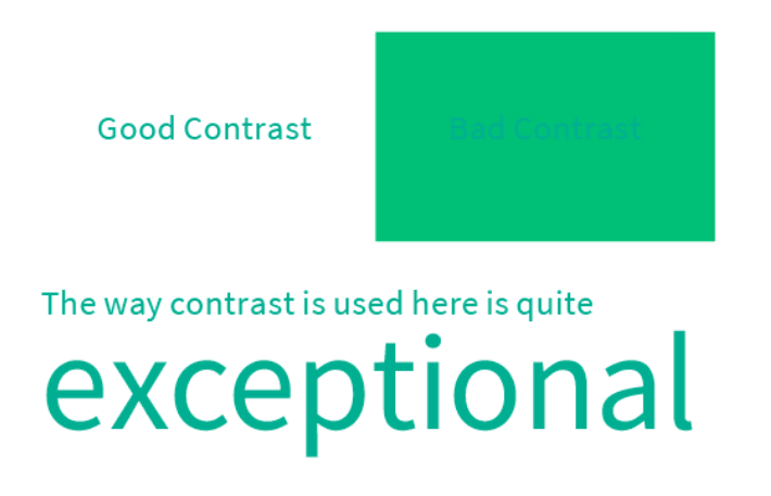
Contrast is the difference between two elements, whether that be in size, color, shape or even typeface. Contrast is a useful tool for emphasizing or drawing attention to different elements, such as when you bold or italicize words or phrases to distinguish them from the rest of the sentence. Contrast also relates to legibility. Below, the “Good Contrast” image is easy to read because the green text stands out against the white background. Next to it, the words “Bad Contrast” are difficult to make out because there is only a slight difference in color between the text and the background.
You can also see how contrast can be achieved by varying the size of the type. When used well, contrast makes designs more intriguing, dynamic and useful for the viewer.
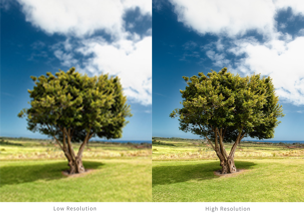
5. Resolution
Resolution describes the level of detail in an image based on the density of pixels in a given area. The difference between low and high resolution isn’t always as obvious as in the example below, but it’s still important to check that all images (not just photos) are being exported and used at the right resolution. This is especially important if any of the images are going to be printed.
6. Stock photos
Stock photography is a supply of photos often licensed for a specific use. Stock photo websites are incredibly useful in the graphic design world, where you can find royalty-free images for just about any need. Stock images are great if you don’t have the time or resources to pay for original photos. Many times they are used as placeholders to demonstrate a certain concept before adding the final images. Here are a few HubSpot-recommended free stock photography websites to check out.

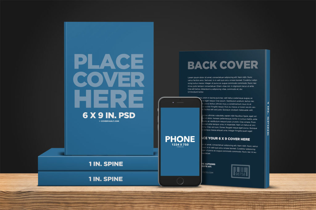
7. Mock-up
Mock-ups are used to show how final designs will look once they are applied to the final product. Before giving the green light to print, manufacture or install a design, it’s helpful to review mock-ups to ensure every detail looks right and has been applied properly. In the example below, seeing the mock-up of a book jacket design helps you view it with a better sense of scale. You can see how each component of the design fits together and determine whether any revisions need to be made.
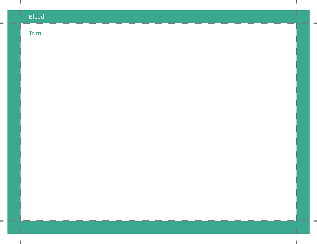
8. Bleed and trim
Printing is a precise and detailed process. In order to ensure the highest level of accuracy, the design file should include both trim and bleed. The trim is the outside edge of the design. If you were using scissors to cut out the design, you would cut along the trim. The area outside of the trim line is the bleed. It’s an extension of the design that ensures that slight mistakes when cutting the design won’t be as obvious or visible. The bleed serves as a back-up print around the edges of the actual print to leave some margin for inevitable minor inaccuracies.
9. Icon
Icons are a fun and interesting way to depict ideas, concepts or shapes in a unified way. In modern design, almost all mobile and web interfaces use icons in some way. One of our favorite sites for icon inspiration is The Noun Project, a collection of icons submitted by designers from all over the world.
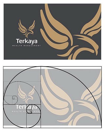
10. Golden ratio
The golden ratio is a version of a grid that’s based on a ratio found in countless natural forms. Using the golden ratio gives a design unity and ease because it will feel natural and almost familiar without the viewer even realizing why.
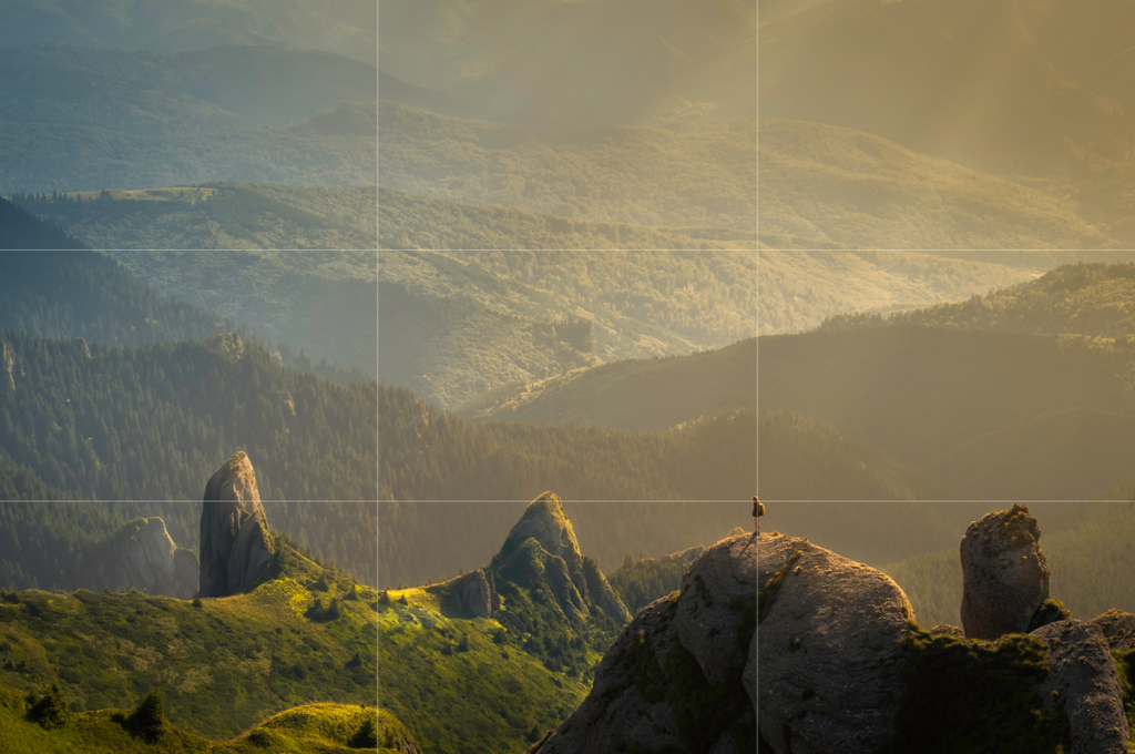
11. Rule of thirds
The rule of thirds is another frequently used grid form (one you may have heard of from your photographer friends). It is a simple technique for creating a visually pleasing image using the grid lines as your guide. For example, in the photo below, the top of the rocks in the foreground roughly fill the bottom third of the image, and the tops of the hills in the background touch the edge of the top third. The bird perched on the rock is right on the intersection of the vertical and horizontal lines, and each of the three rocky peaks behind the bird fill a different third of the photograph.
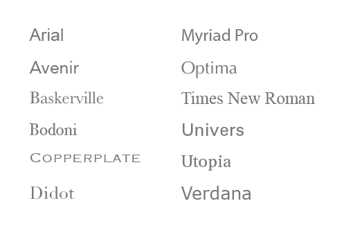
12. Typeface
A typeface refers to a set of fonts, also called a font family, that have a particular design and style. Below are some commonly used typefaces that you may recognize.
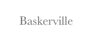
13. Serif typeface
A serif typeface is defined by the inclusion of a “serif” in the design of the letters. Serifs are the short lines that hang off of the edges of the letters, like in Baskerville, shown below. Serif typefaces are generally easy to read, and tend to be used for longer sections of text. Serif typefaces also tend to give a more classic or elegant feel to a design.
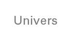
14. Sans serif typeface
A sans serif typeface does not have serifs in the letter designs, which allows for a more geometric look, as seen below in Univers. Sans serif typefaces were originally designed for headings and large text, but are now widely used in many aspects of modern design.
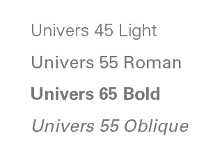
15. Fonts
Typefaces, or font families, are made up of a set of fonts. Each font has a different weight and posture, such as oblique (italicized), light, bold or condensed. Choosing a typeface that includes a variety of font options will allow the designer to use different fonts for contrast while still achieving a unified look.
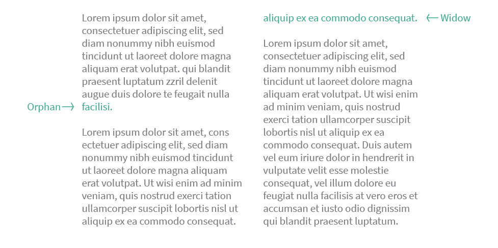
16. Orphans and widows
An orphan refers to a single word that stands alone on a line. A widow refers to the last line of a paragraph that wraps to the next column or page, disconnecting it from the rest of the paragraph. Graphic designers generally avoid designing text that has orphans or widows whenever possible since they break up the unity and flow of the paragraphs.
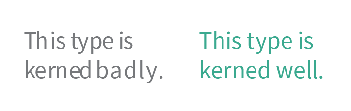
17. Kerning
Kerning is the amount of space between two letters, as shown in the example below. Often times, the default kerning between letters can be a little off and needs to be adjusted. This is especially true with less expensive fonts downloaded from free font websites where the kerning isn’t perfectly set. The inconsistent spacing with bad kerning tends to make words more difficult to read and it can make the design look unfinished or unprofessional. Good kerning, on the other hand, is what our brains are most used to reading, so it feels correct and reads much more easily.
18. Tracking
Tracking refers to the space between letters in an entire word or selection of text. Whereas kerning referred to the space between two individual letters, tracking is talking about a larger selection of text — typically a word or sentence. As with kerning, good tracking means the text will be easier to read.
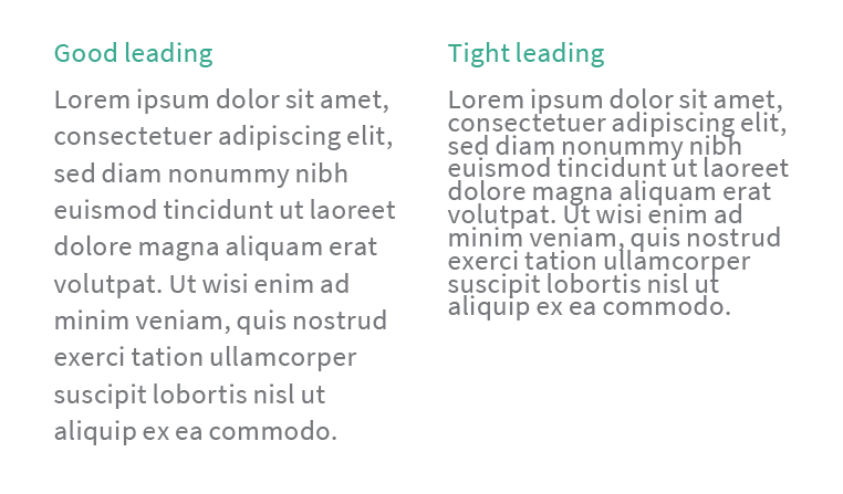
19. Leading
Now that we’ve covered the space between letters, let’s talk about the space between lines. Good leading is the sweet spot that allows for the best readability based on the font size. On the left is an example of good leading; the text is easy to read and each line has room to breathe. On the right, the lines are so close together that it becomes much more difficult to read. If the leading in this blog post were that tight, you probably would have stopped reading halfway through the first paragraph.
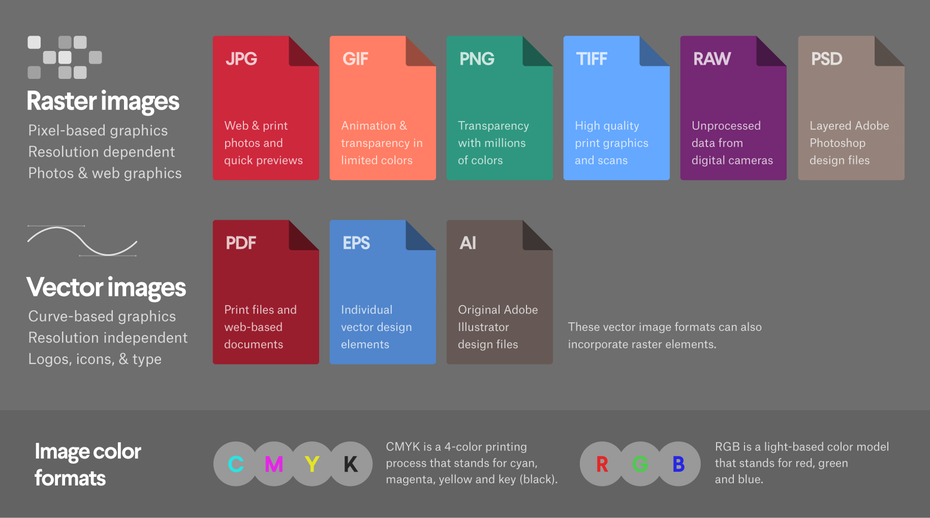
20. File types
There are a lot of file formats out there, but here are the key types to know so that you and your designer are always on the same page. Each file format has its own set of advantages and drawbacks, so it’s vital to understand the differences between each one. Here’s a great quick reference guide from 99Designs that you can refer back to whenever you’re asked to choose a format. Pay special attention to the difference between raster and vector images, and CMYK versus RGB color formats. These seemingly tiny details can have a huge impact on the outcome of the design.
Share these terms with your team
Were there any terms that were new to you? Who else on your team would enjoy this quick refresher on design vocabulary?
Before your next design project, share this post with your group so everyone can get on the same page and speak the same language. Learning how to see a project through someone else’s eyes is a great skill to cultivate, and graphic designers will appreciate your willingness to learn about their world and be a better collaborator. The result? Better design AND a better experience for all.


LEAVE A COMMENT
Comments